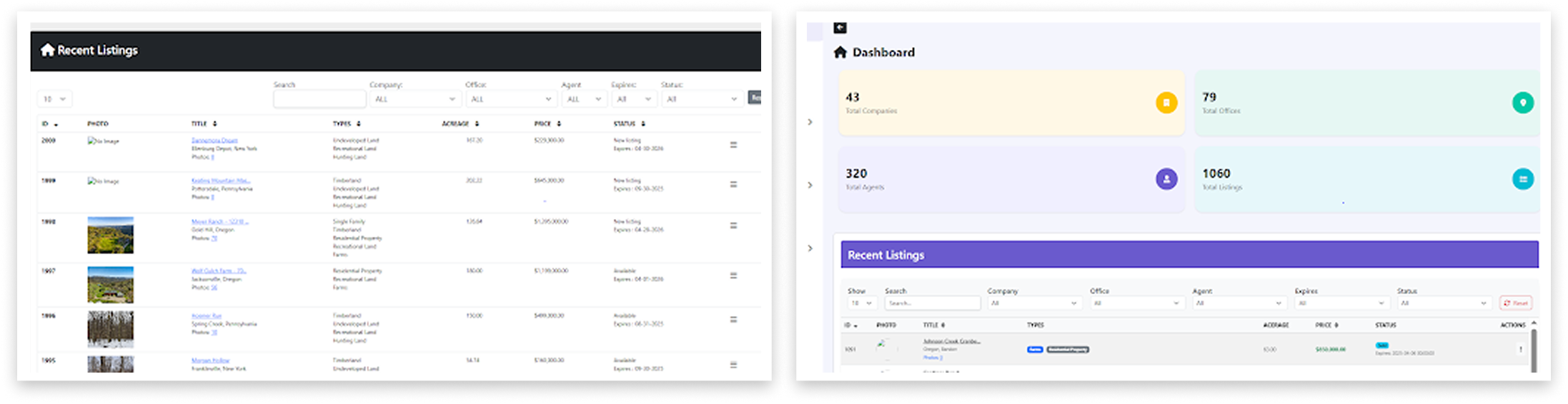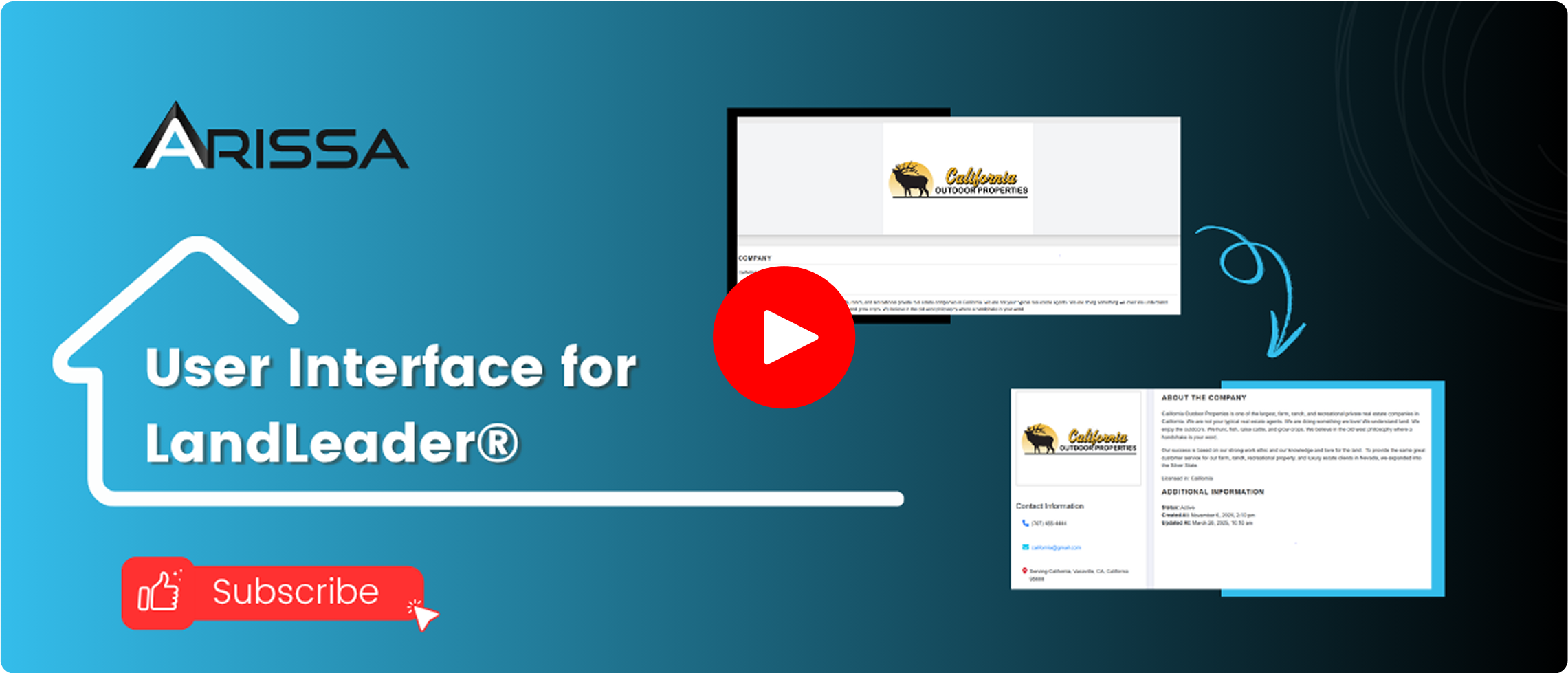


Centralized Metrics on the Dashboard
Key data—like total agents, listings, and companies—was surfaced directly on login, streamlining navigation.

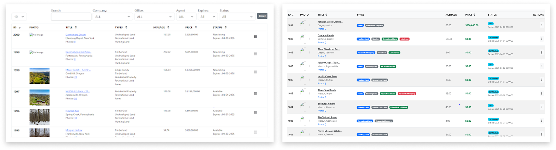
Color-Based Status Labels
Property statuses were redesigned with distinct colors (e.g., blue for available, green for sold), allowing instant recognition.

Property Type Visual Enhancements
Each property category now features a unique color and design, offering immediate context and simplifying browsing.

Improved Visual Hierarchy
Pricing was highlighted in green, fonts resized, and layout adjusted for a left-aligned, more digestible format.
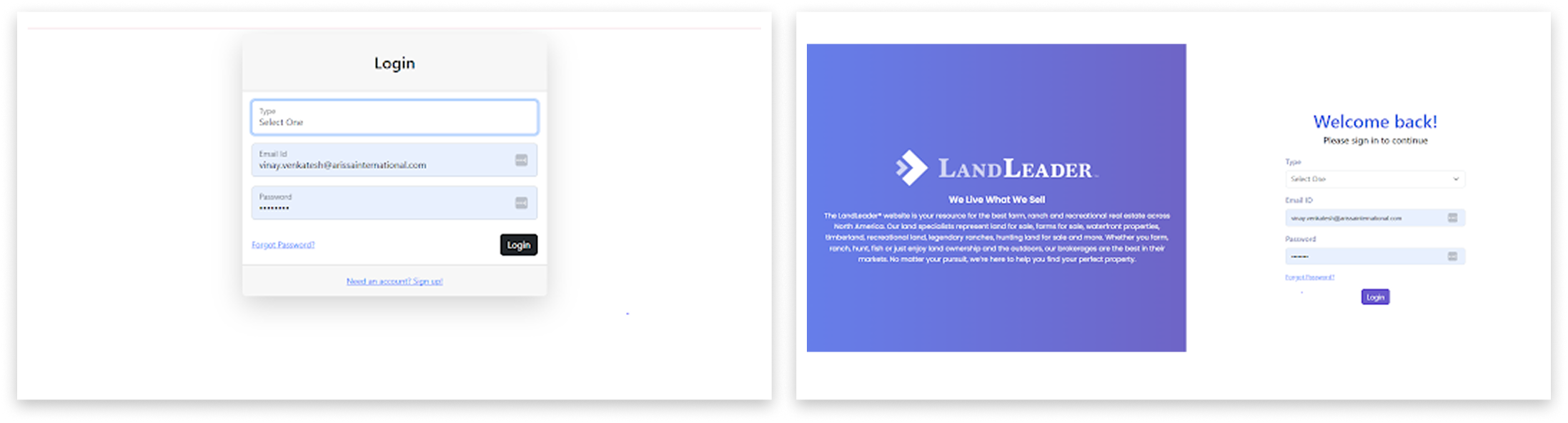
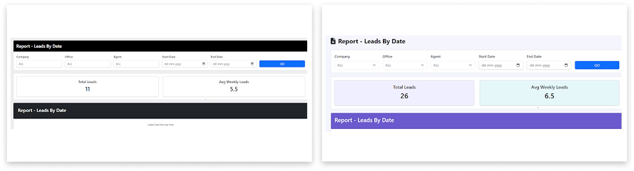
Modernized UI Design
The overall UI was refreshed with consistent spacing, intuitive navigation, and a professional visual palette that aligns with the brand identity.
Centralized Metrics on the Dashboard
Key data—like total agents, listings, and companies—was surfaced directly on login, streamlining navigation.
Color-Based Status Labels
Property statuses were redesigned with distinct colors (e.g., blue for available, green for sold), allowing instant recognition.
Property Type Visual Enhancements
Each property category now features a unique color and design, offering immediate context and simplifying browsing.
Improved Visual Hierarchy
Pricing was highlighted in green, fonts resized, and layout adjusted for a left-aligned, more digestible format.
Modernized UI Design
The overall UI was refreshed with consistent spacing, intuitive navigation, and a professional visual palette that aligns with the brand identity.

Centralized Metrics on the Dashboard
Key data—like total agents, listings, and companies—was surfaced directly on login, streamlining navigation.

Color-Based Status Labels
Property statuses were redesigned with distinct colors (e.g., blue for available, green for sold), allowing instant recognition.

Property Type Visual Enhancements
Each property category now features a unique color and design, offering immediate context and simplifying browsing.

Improved Visual Hierarchy
Pricing was highlighted in green, fonts resized, and layout adjusted for a left-aligned, more digestible format.

Modernized UI Design
The overall UI was refreshed with consistent spacing, intuitive navigation, and a professional visual palette that aligns with the brand identity.